
SV 210615
Meeting agenda
Folio
Works, substrates, presentation.
Writing
Submitted assignments for LCP and Studio for feedback.
Revised LCP Objectives and Rational assignment for troubleshooting and additional feedback.
Studio Critical Review assignment for feedback, time permitting.
High priority
Objectives – They are what I am having the most trouble with.
Opening two paragraphs of rationale – I don’t understand what Jan is suggesting.
Notes
Swap paragraph 1 and 2
First paragraph: How and why (what I used and why) - how does this connect to my methodology.
Second paragraph: Story.
Objectives
Incorporate sentences to encapsulate each objective.
Do not repeat.
Ensure each element is covered.
How do art and music relate to the project?
Explain more clearly.
What role does music play in the research?
Community and cultural hub.
Comes in through interviews with musicians.
Can I be fucked explaining this part of the process?
Probably not. It is probably no longer relevant other than these people are my mates and kindred spirits.
Music no longer has a part to play in this project or in my research.
Although, art and the creative process is still a critical factor and relates directly to my research.
Research question.
David doesn’t understand the question.
Break it down and simplify.
Be clear and concise.
Should read intangible, NOT temporal.
Be more concise and better articulate objectives what, how and why.
Fragmentation inspired by gestalt (reference fragmentation.
Explain “novel gestalt”.
Haptics – Subjects.
Haptics – Part of methodology (explain).
Performative collaboration in ICMX and photograms – Subjects.
General
Rewrite objectives, statement and rationale. Check active verbs, transition words, answer words and question words.
Be mindful of what, how and why.
Double-check writing notes.
210601 SV
David and I viewed a number of prints in 2.2.1 before lockdown. Standing in front of works is essential. Even proofs or roughs on newsprint count. The feedback David provided was very valuable. We discussed image sequence for the in-camera multi-exposure (IMX), orientations, substrates and print methods. I have provided David with a PDF for discussion in our SV meeting today.
Meeting notes
Today’s meeting was very productive. Having an agenda is beneficial, particularly to keep me on track as I do tend to digress!
Meeting agenda
Writing: Theoretical influences?
Writing: Email David Language of Creative Practice (LCP) assignment drafts and revised previous submissions for comment.
Images and concept: Connecting elements of project photographically — Abstract (lines, shadows, webs) representing brain activity (rhythmic) when viewing and making art.
Images and concept: Smoothing project with smaller portraits. Introduce gentle undulations.
Images: Supplied PDF of images as requested to review and discuss.
Handmade works: No new photogravure or screen prints to show due to lockdown.
Expanding too much.
Hold on till semester 4.
Shoot roll.
Focus on photograms.
Transparency.
Multi exposures.
Keywords
SV, Studio, Semester 3, Development of practice, Image review
Transgenerational trauma
FRACTURED – IZO
COLLECTIVE TRAUMA OF COVID-19
I have been thinking about the foundation of my fractured theme and basing it on the collective trauma COVID-19 and Melbourne’s Stage 4 lockdown.
I am satisfied with my research, which includes Kintsugi inspired applications to the work. Kintsugi or “golden joinery” is the Japanese art of repairing broken pottery with lacquer mixed with precious metals including gold and silver. Philosophically, Kintsugi treats breakage and repair as part of the history of an object, rather than something to disguise, embracing the flawed or imperfect. Marks of wear by the use of an object are also highly valued. Applying this philosophy to my project connects the fragmented and fractured to evolution, healing and beauty.
I am also researching Gestalt design principals, where the brain seeks to make sense or order of fragmented or impartial images. The principals of Kintsugi and Gestalt are critical theoretical applications to the foundation of this project.
TRANSGENERATIONAL TRAUMA
It is the collective trauma of COVID-19 that makes me uncomfortable, and have realised that I can only speak or share of my own, be it personal or ancestral.
The foundation of my IZO series has subsequently changed, and I am now exploring transgenerational trauma. It is interesting to consider, particularly with my ancestry. I am looking forward to researching the psychological conditions of social, cultural or political impact (in many cases, all three) and their relationship with genetically passed on information and applying this to my practice.
My ancestors are Eastern European — Russia, Hungary and Romania – and on both sides (paternal and maternal), survivors of WWII Europe. We came to Australia seeking asylum, and are refugees in this land that we now call home.
THE SERIES
After careful consideration, I am satisfied that my research and application of the aesthetics and theories of Kintsugi, Wabi-Sabi and Gestalt are applicable and relevant to my project. The images also relate powerfully in a contemporary setting.
Course feedback – Utilising personal resources
210511
Conversations
Our studio classes are all theory and about academic writing. I feel like we are being “read to” in the classes and do not have the opportunity for open discussion which inhibits not only learning but putting the theory into practice through conversation. The benefit of the cohort sharing their ideas, thoughts and concepts is invaluable.
Workarounds
Find your own resources and means to articulate and communicate.
Read aloud.
Question research material and resources.
Speak critically about your own work.
Find your own voice.
Reviews and group crits
Last year we had a lot of group crits. They are a valuable source of feedback and a foundation for the development of practice. The learning gained in group crits may also be extended to academic writing in that the cohort addresses work directly. Through this open communication, building vocabulary and establishing structure and form in the language of art and theory.
This year conversations have been lacking in that there are minimal group crits and opportunity for debate and sharing of ideas.
Workarounds
Watch or attend 2 artist presentations per week.
Read for 2 hours every day – Writing, Theory, Psychology/Philosophy.
Write a critique of your own work once a week — 200 words.
Tethering lightroom
I now am in Adobe Creative Cloud and resent it and that everything in the Master of Photography course is structured around digital photography with little if any support and teaching for analogue processes.
Side note. It was interesting to learn that a Semester 3 student is using scans of found objects for their final year projects. Is this not akin to photocopying?
Liquid emulsion 1
I’m starting to research making liquid emulsion prints on hard surfaces such as glass and perspex. The chosen substrate must be treated with a base coat of varnish before printing so the image adheres to the surface. I am also researching how to make the finished print weatherproof.
Fotospeed Liquid Emulsion is the preferred product for this project. After trying several different brands of liquid emulsion, Fotospeed produces the best and most consistent results.
The Fotospeed LE spec sheet advises using Griffin Varnish (readily available) on substrates such as glass and ceramics. There are readily available water-based alternatives.
I am looking forward to experimenting with and small pieces of perspex and vinyl and seeing how effective the water-based varnish is as a base-coat and in waterproofing the liquid emulsion prints.
Keywords
Semester 3, Liquid Emulsion, Alternative darkroom printing, Varnish
References
Ekerseleys n.d., ‘Chromacryl Water Based Finishing Varnish’, viewed 9 February 2021, <https://www.eckersleys.com.au/chromacryl-water-based-finishing-varnish>
Eckersley’s n.d., ‘Winsor & Newton General Purpose Varnishes’, viewed 9 February 2021, <https://www.eckersleys.com.au/winsor-newton-general-purpose-varnishes>
Eckersley’s n.d., ‘Winsor & Newton Dammar Varnish’, viewed 9 February 2021, <https://www.eckersleys.com.au/winsor-newton-dammar-varnish>
Fotospeed n.d., ‘LE30 Instructions’, PDF, viewed 9 February 2021, <http://www.fotospeed.com/media/Instructions/LE30%20Instructions%20-%20sgl%20sht.pdf>
Fotospeed n.d., ‘Liquid Emulsion’, viewed 9 February 2021 <https://www.fotospeed.com/LE30-Liquid-Emulsion/products/1288/>
Fotospeed n.d., ‘Liquid Emulsion MSDS’, PDF, viewed 9 February 2021, <https://www.fotospeed.com//media/cms/Darkroom/Liquid%20Photographic%20Emulsion.pdf>
MCC IWD Group Exhibition 2021
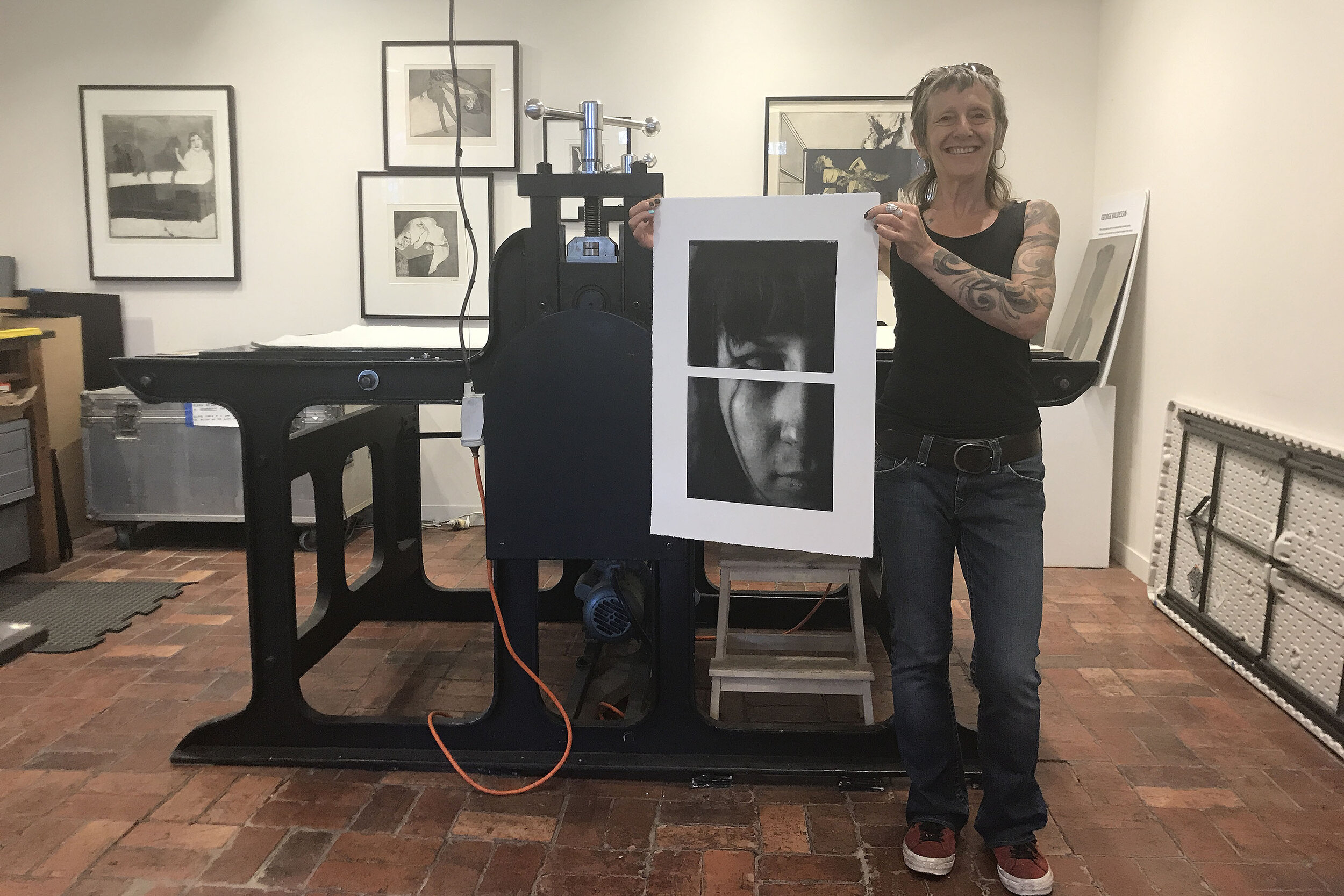
Piss baby redux (Damage, Z 2021). Photo © Silvi Glattauer.
470x700mm
Photogravure print on paper from scanned original diptych liquid emulsion print on paper created from 35mm negative.
This photograph is of my daughter.
I asked her what she would like the title to be, to which she replied, "Piss baby".
I added "redux" to reflect the multiple analogue processes (redux of bespoke liquid emulsion darkroom print to photogravure).
The image symbolises the challenges of what it is to be a woman today. The diptych format raises the question (encourages discussion) of what defines womanhood.
Pull life apart.
Put it back together.
Revise.
Redefine.
Be yourself.
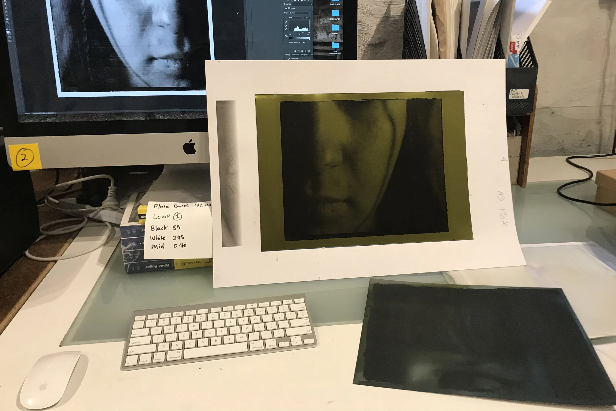
Photogravure plate making workstation
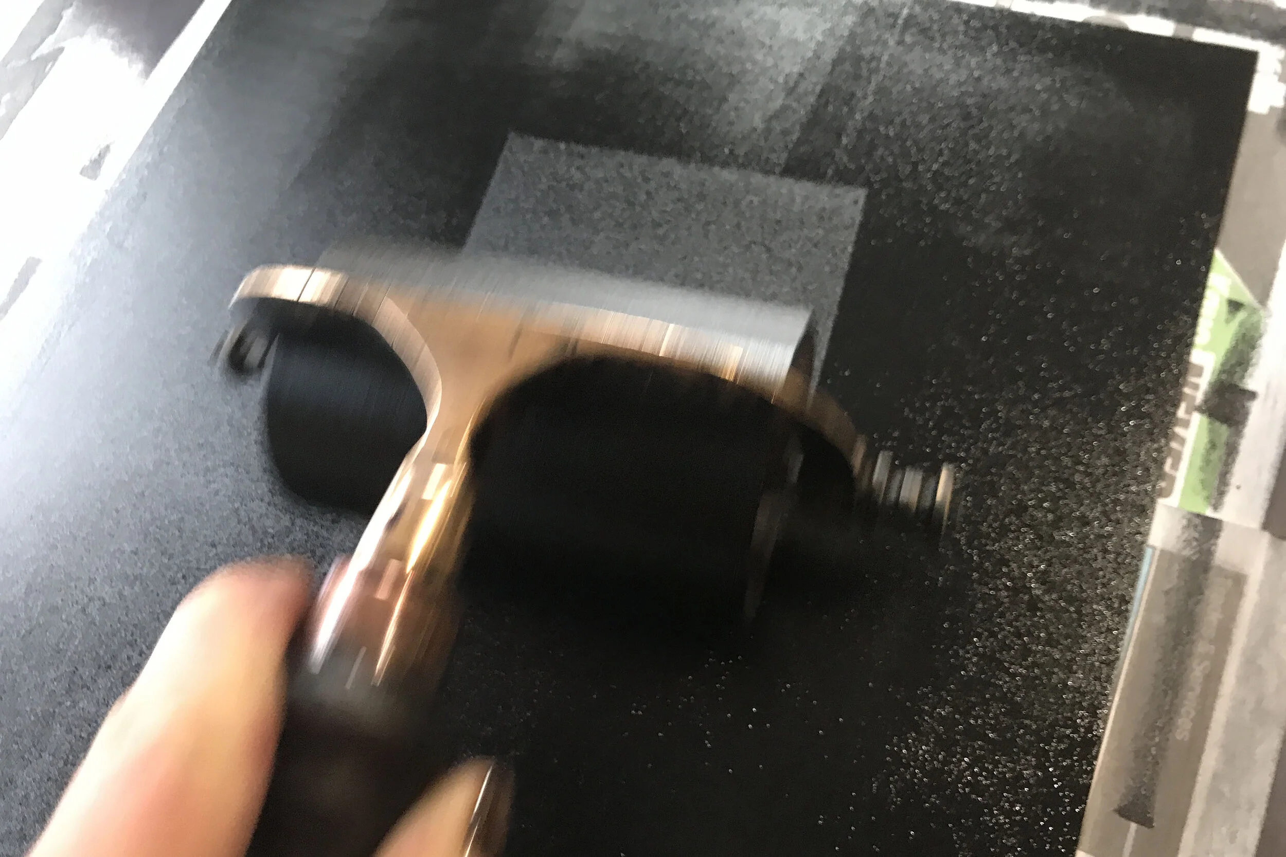
Rolling ink on photogravure plate
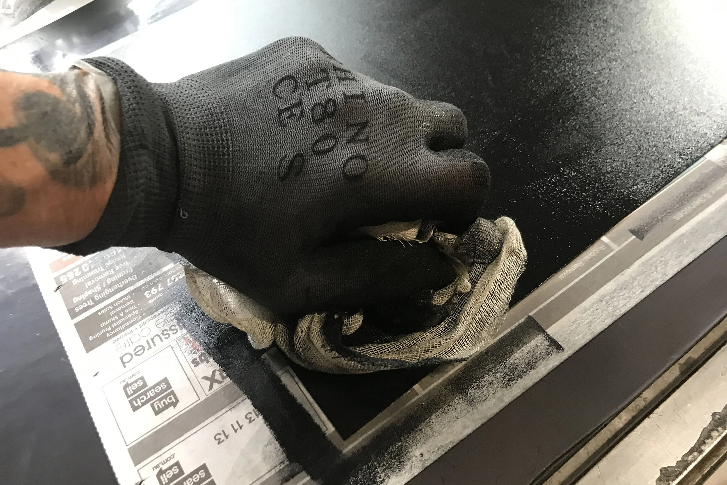
Pressing ink into photogravure plate
When scanning the original liquid emulsion prints to make the photogravure plate, I left the rough edges in (see below). After making the photogravure proofs, I was not happy with these edges as it felt like too much was going on in the image to the point that it was distracting.
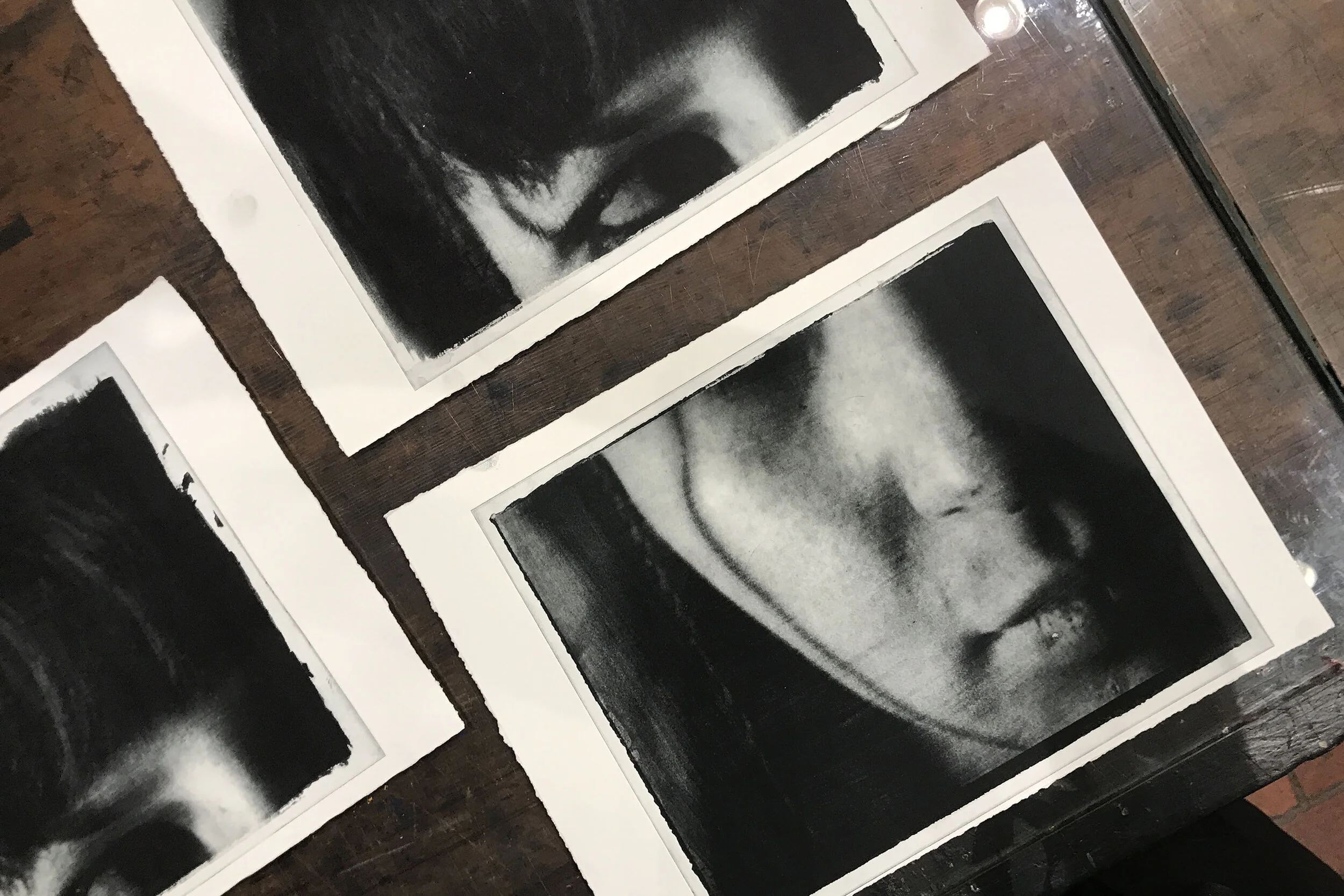
Piss baby proofs (plate 1 and 2).
It is essential to note the many process and subsequent nuances. The original image was photographed on 35mm film, created as a bespoke diptych liquid emulsion darkroom print on Fabriano Rosaspina, scanned, and then recreated as a photogravure.
Although I considered remaking the photogravure plates, which is expensive, I decided to experiment with the existing plates, cutting them down to remove the rough edge, which worked well.
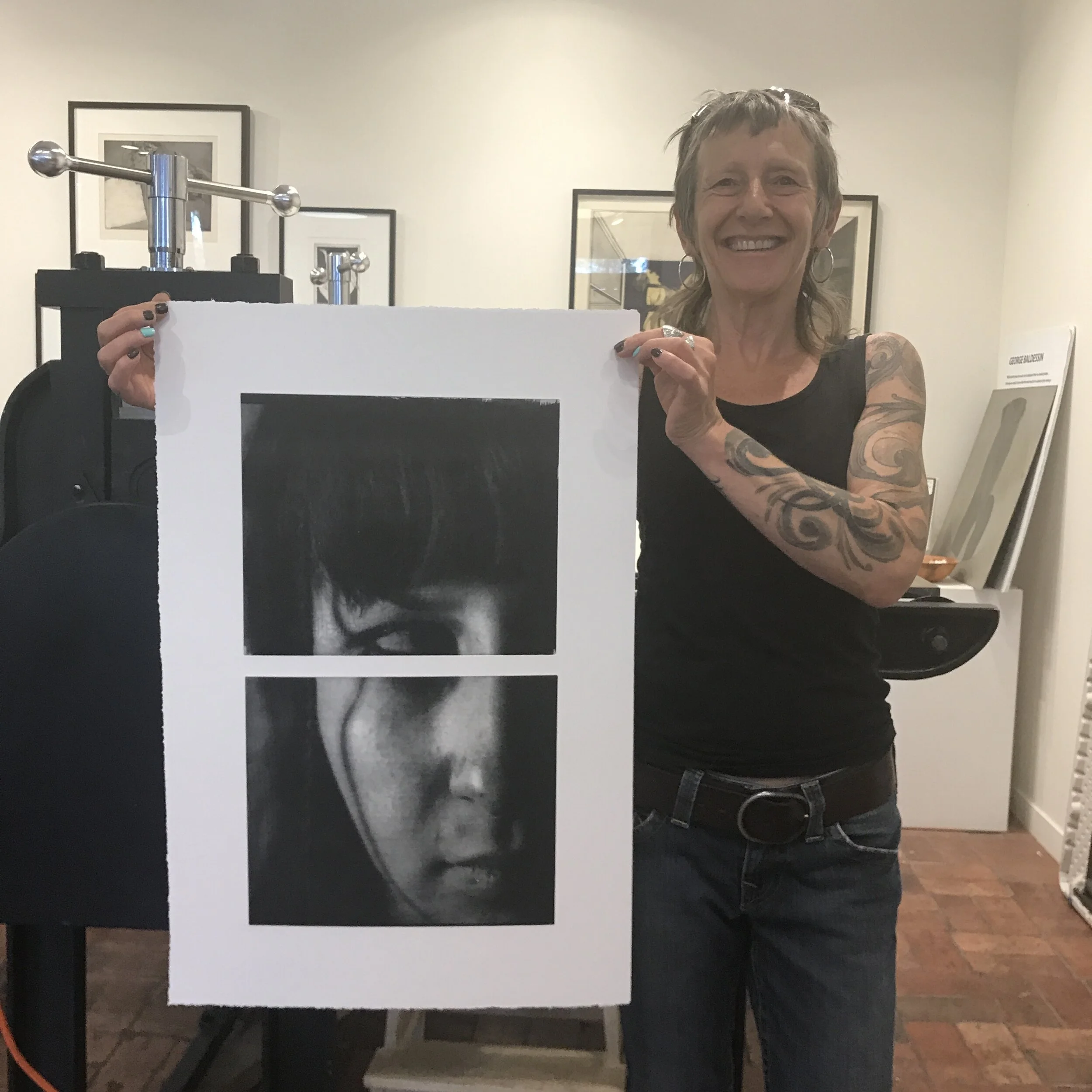
Piss baby redux (Damage, Z 2021). Photo © Silvi Glattauer
Keywords
Photogravure, Liquid emulsion, 35mm, Darkroom, Printmaking, IWD, MCC, Proofs
The Renaissance and Modernism
I have begun to research the Renaissance and Modernism from a different perspective. Modernism is considered to be the most historically significant art period since the Renaissance, leading me to question why, and to learn more about each period, the art movements and artists, and what the connections and similarities between the two are.
It is interesting to consider the sociological implications in both periods, particularly in considering social structures, class, political climates, religion and philosophy.
I no longer identify as a photographer and am questioning why I have not enrolled in the MFA program.
Keywords
Modernism, Renaissance, Photography, Visual art, Conceptual thinking
Book design on the fly
A friend needed help with the design for their latest book with only hours to make the print deadline. The cover they had created was simply not working. They were having problems with the file they had created in photoshop. Below is the cover art they initially send through to me to troubleshoot why the colours were not translating correctly.

BRAVE (de Angeles, L 2021)
Cover design Ly de Angeles. Photo © Serenity de Angeles
The file included poorly executed photoshop masking, a low-resolution base image, and multiple filters not suitable for print. From a design perspective, the cover (front and back) needed to be simplified with fewer font families and assess the integrity of the original base image.
I took a punt and sent Ly a sample which she loved.
After a brief phone call followed by an email outlining what was needed to complete the job, Ly sent through everything I had requested, including prepress specifications, the list of fonts used in the initial design and the original image as supplied by her photographer which was, fortunately, a CR2 file.
Below is my redesign as supplied to Ly.
The book is now with the printer.
BRAVE (de Angeles, L 2021)
Cover design by Zo Damage. Photo © Serenity de Angeles.
Keywords
Book design, Redesign, InDesign, Photoshop, Prepress, Friends
References
de Angeles, L 2021, Brave: Lore for the Unclaimed People, Ly de Angeles, Melbourne, Australia
Constraints and reflections
I am concerned about additional constraints implemented by RMIT this semester impacting on my final year outcomes and grades. It is essential to consider the financial impact these new constraints have had, in that I am unable to use my home darkroom for study purposes.
I have budgeted and purchased enough darkroom and printmaking supplies (hardware and consumables) to ensure my development of practice and project outcomes for submission.
This planning has kept my expenses manageable and provided the security of being able to continue my study as I do not need to worry about outsourcing.
It is important to reiterate that Materiality is a critical part of my practice.
To maintain this materiality under the current circumstances I have produced my end of semester project as a printed book.
I have had to choose potentially sub-par materials to keep the cost down as it was not in my budget. This includes the cover, paper stock, book size and number of pages. The short-run/print on demand (POD) service places their corporate brand/logo on all orders. They charge an additional 25% to remove it which is money I don’t have.
Unfortunately, this means I have worked very hard all year only to produce a final semester project, that I feel, falls short of an acceptable standard for submission.
I am concerned that this, through no fault of my own, may impact on my grades.
On the flip side, the steps that I have taken throughout 2020 show my resilience and resourcefulness under adverse circumstances.
Side note.
Reflecting is relative.
I have worked for 15 years with a time limit of 3-15 minutes per shoot. No flash. No tripod. No monopod. No staging. No repeats. No going back another day.
60 seconds is a lifetime.
It feels that I am expected to adopt the fears and self-doubts others have of their own practice.
Fuck that.
Another side note.
I am also concerned that I am being encouraged to take on others love of being traumatised.
Fuck that too.
Tokenism and cultural appropriation
I am researching tokenism and looking at the comparisons between it and cultural appropriation, reading scholarly articles on the subjects.
I have found articles about tokenism in academia. It is encouraging to know that people are investing in questioning this topic.
It would also be interesting to research the issue of cultural insensitivity. I must add here that, having witnessed this myself on several occasions, I firmly believe that this issue stems from ignorance and a genuine lack of cultural understanding, which is inexcusable when considering the political foundation of academia in the arts.
Will this politically correct bubble fuelled by middle-class guilt, fear and ignorance burst? Of course not, it is designed to ensure its survival.
Historically, extremism on any side of the political fence are inevitably followed by a knee-jerk social reaction in the opposite direction, which substantiates (no matter how vile) the current rise of the extreme right.
Obsession, fear and over-steers
I do not like uni and feel that the course has strayed from its listed outline.
Would I recommend the course?
Absolutely not.
There is a lack of accountability for teaching staff. Interestingly, some are actually attempting to shirk these responsibilities further.
So far we have had to endure an obsession to discuss queer and feminist politics in our class time, shifting to oversteer toward industry guest speakers taking up our class time on a weekly basis along with another obsessional shift into pushing students into animation, 3D imaging and CGI.
We are now faced with a new obsession of increasing the academic component with more writing and less art required. As I understand it, I signed up for Masters by course work and there is a Masters by research course available for those that choose to follow that path.
It had also been disappointing to see students accepted into the second semester that is not photographers. Bang goes the line of credibility and exclusivity.
Then there is our being presented with lectures on feminism and racism by white middle-aged men which is nothing short of inexcusable. I am tired of tokenism. Actually, there are articles written about tokenism in academia. I have been reading a few. It is at least encouraging to know that I am not the only one questioning why it is so acceptable. The irony that the worst perpetrators of tokenism speak frequently against cultural appropriation.
There is also the issue of cultural insensitivity. This appears to stem, yet again, from a place of the privileged white middle class.
I will finish this, although I am now confident that I have not only made the wrong choice but that the course itself is not up to a professional standard.
Ironically, I am not the one they need to worry about. There are students making enquiries as to how to proceed with formal complaints and refunds based on the above.
I Zo — W09
S2 S1 Week 9
Presentation
I ZO faces breaking points past and present, embracing the flawed and imperfect.
The collection combines alternative printing and darkroom processes. Many prints fractured with a diptych, triptych and polyptych displays, the fragments honoured and reconnected, with a newfound voice and beauty. What are imperfections? They are that which makes the whole.
— Zo Damage
Feeling broken and lost amidst the intensified isolation, I seek to make sense of the world and am confronted by coming with my own company. I search for ways to embrace the restrictions and the creative process in a positive light.
"I Zo" is a story of breaking points, healing and the joy of being imperfect.
I have made this work using film photography, darkroom printing and alternative print methods. The collection includes a series of diptych, triptych and polyptychs displays, further highlighting the fractured theme.
My research includes Kintsugi inspired applications to the work. Kintsugi or "golden joinery" is the Japanese art of repairing broken pottery with lacquer mixed with precious metals including gold and silver.
Philosophically, Kintsugi treats breakage and repair as part of the history of an object, rather than something to disguise, embracing the flawed or imperfect. Marks of wear by the use of an object are also highly valued.
I have also researched Gestalt design principals, where the brain seeks to make sense or order of fragmented or impartial images.
The application of these aesthetics further disrupts the narrative, leaving the viewer free to reconstruct, connect and interpret each piece while emphasising the project topic. Visually and philosophically, the Kintsugi and Gestalt aesthetics reconnect the fragmented and fractured. Their beauty redefined.
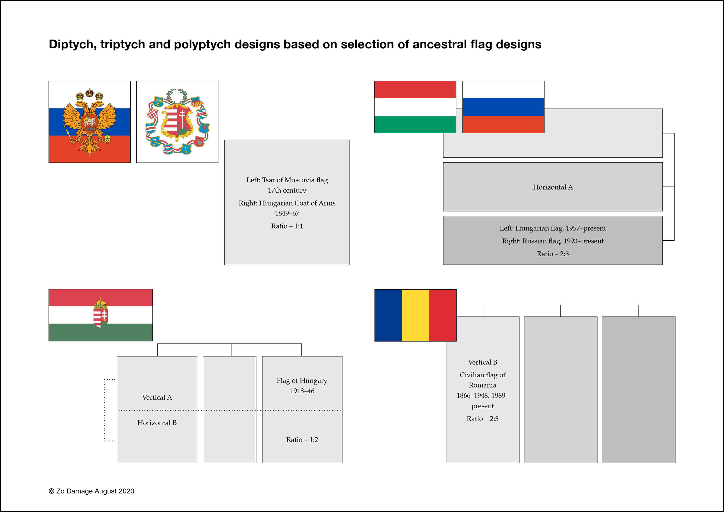
I have created a number of charts (including the above) exploring diptych and triptych designs based on my research on my ancestral flags.
My ancestors are Eastern European — Russia, Hungary and Romania. Survivors of WWII Europe, we came to Australia seeking asylum as refugees.
I am exploring the shapes and geometric designs of my ancestral flags to develop the configurations, shapes and dimensions of the diptych, triptych and polyptych displays in the collection.
This concept also aligns well with Gestalt design principals.
Experiencing the physicality of the work is essential. There is nothing quite like seeing the prints, even when they are small proofs. The images need to work in an online presence, but the intention of the work is always physical. They need to work beautifully across many platforms and potential output mediums.
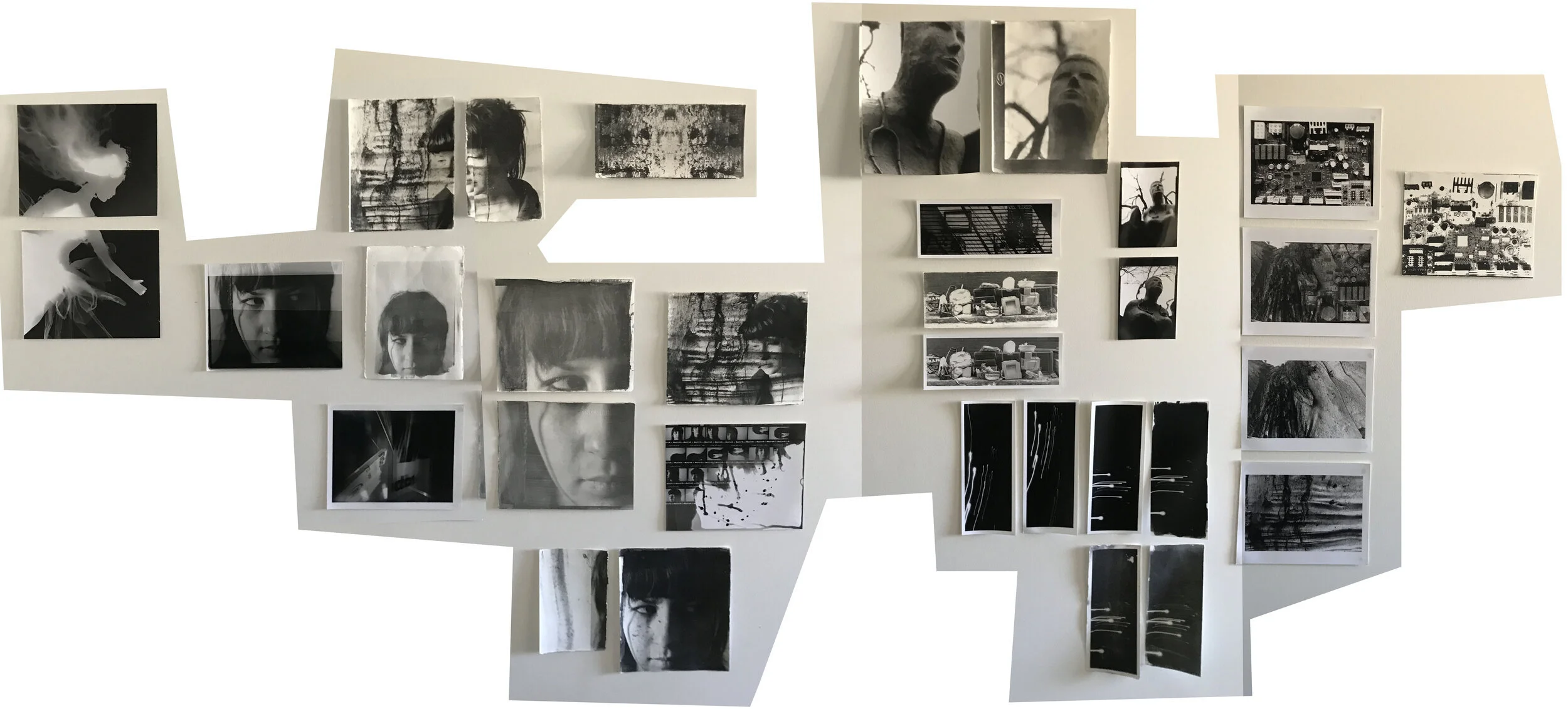
Walls and cupboard doors covered with test prints of current works in progress including liquid light on rag, silver gelatin MGIV and giclée test prints.
Darkroom and alternative print methods require a massive investment of time and willingness to take risks trying new things to produce successful and consistent outcomes.
Testing of the liquid emulsion has been challenging. A great deal of planning and design is also required when considering Kintsugi and Gestalt aesthetics.
The style of images also impacts significantly on the overall look and feel of the final print.
Liquid emulsion prints have a very organic look and feel to them, mainly as the emulsion is hand-painted onto the surface to be exposed.
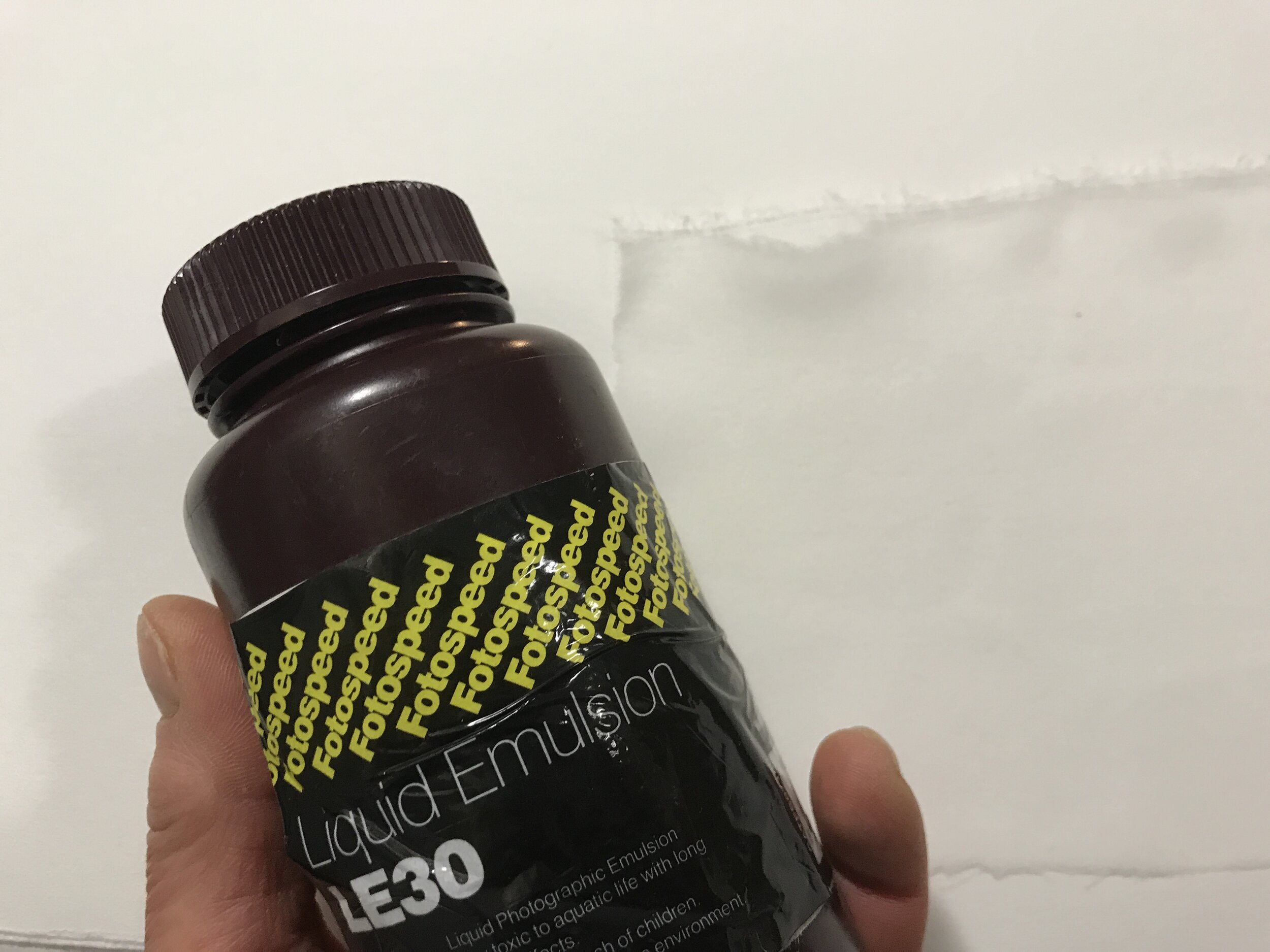
Liquid emulsion is a light sensitive silver gelatin compound.
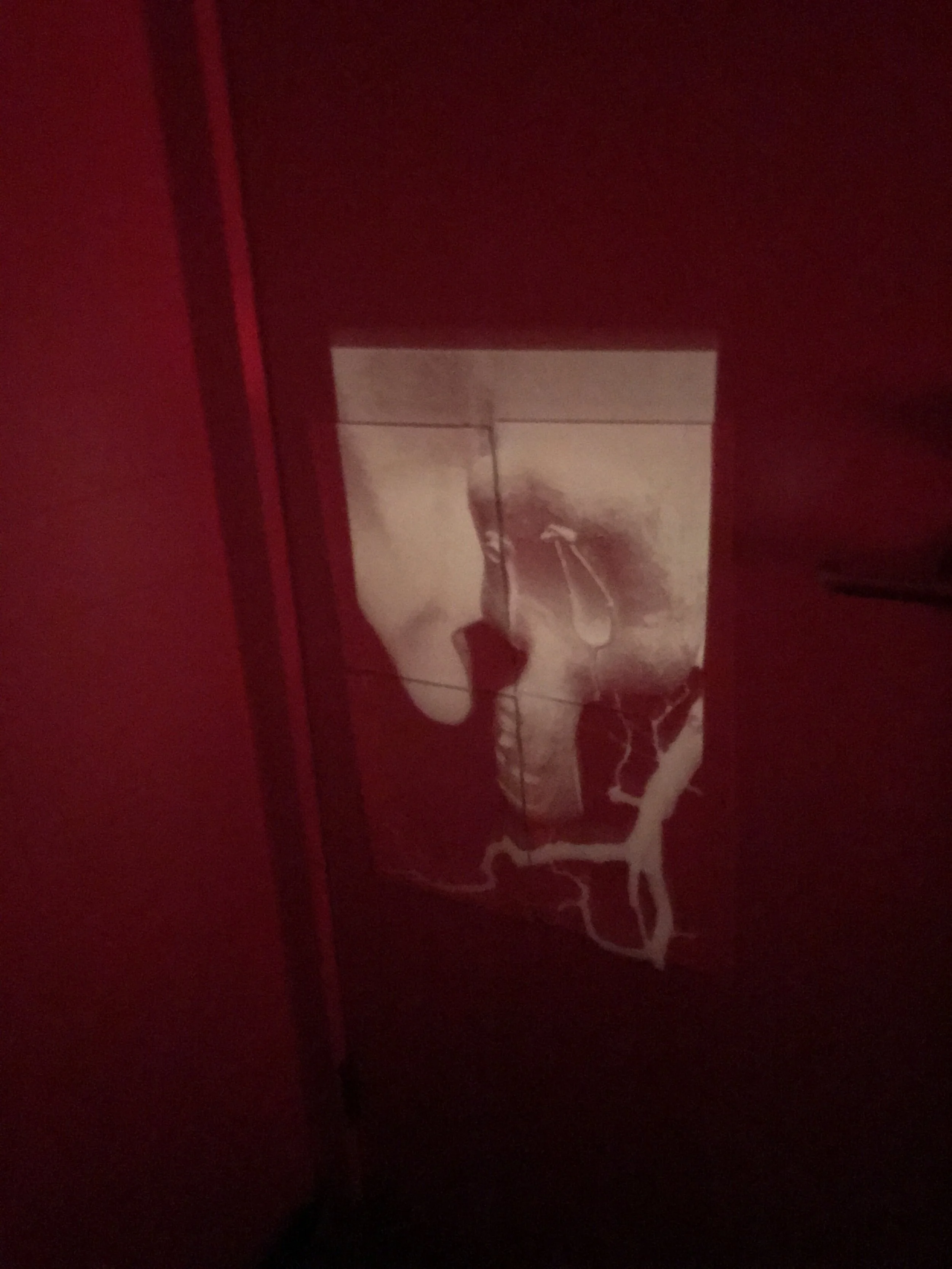
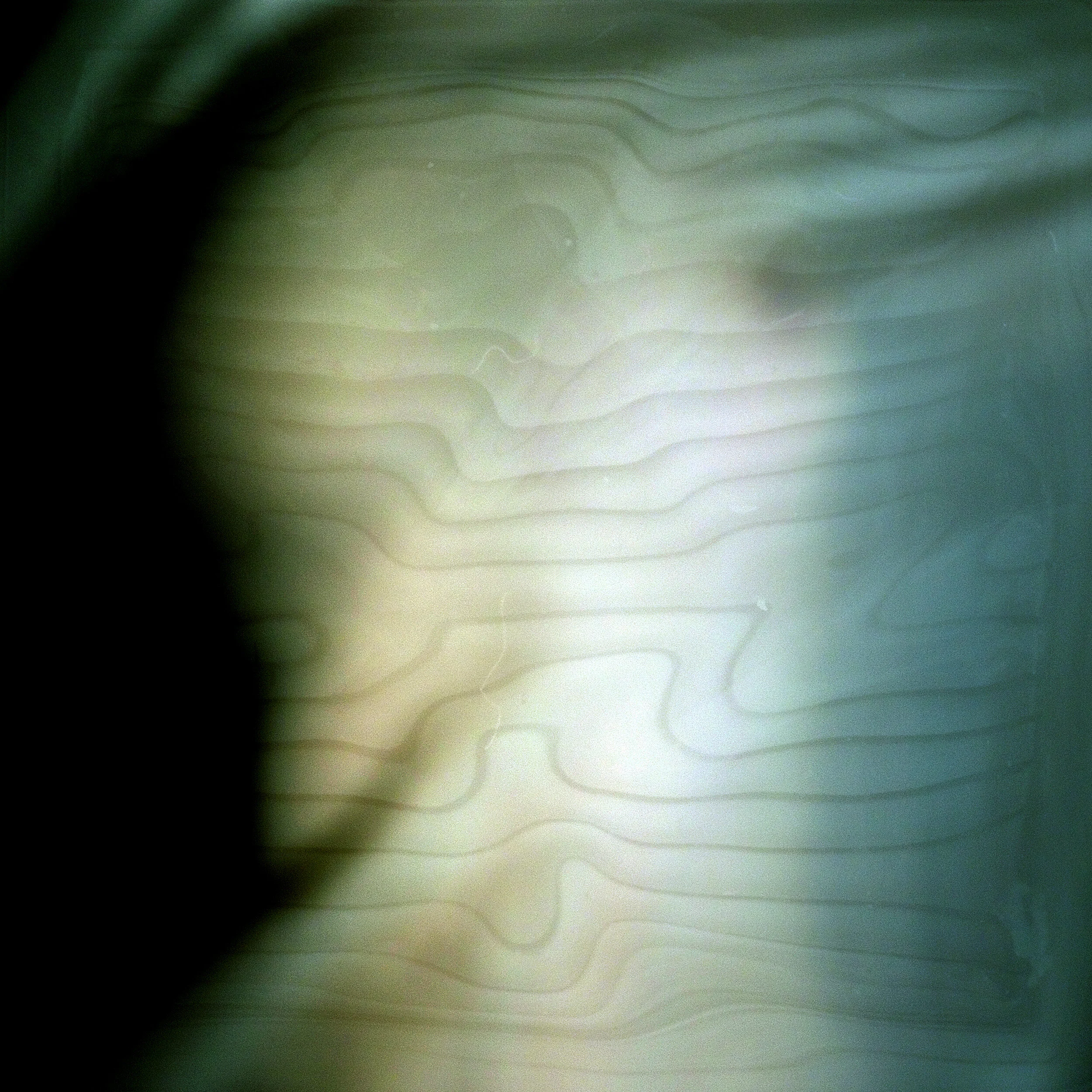
Liquid emulsion treated paper tiled onto the bathroom door. This photograph was taken during the exposure process as the liquid emulsion is light sensitive “silver gelatin” (as with standard photographic paper stock). Safelight is necessary when working with these materials. In some instances, there needs to be complete darkness.
Reflecting on the colour images presented in Week 6 display affirmed that the colour was a distraction.
I am happy with the new B&W images. They invite personal interpretation and emotional connection for the viewer and give the collection a beautiful flow, better reflecting the narrative of the series.
The addition of new styles of photography (portrait, landscape, still-life) brings a deeper connection and continuity to the overall body of work.
A simple portrait or still life can be compelling. The gestalt inspired displays concerning the fractured theme represent the split in knowledge, genetic line, and ancestry recreated as independent and new, yet still connected.
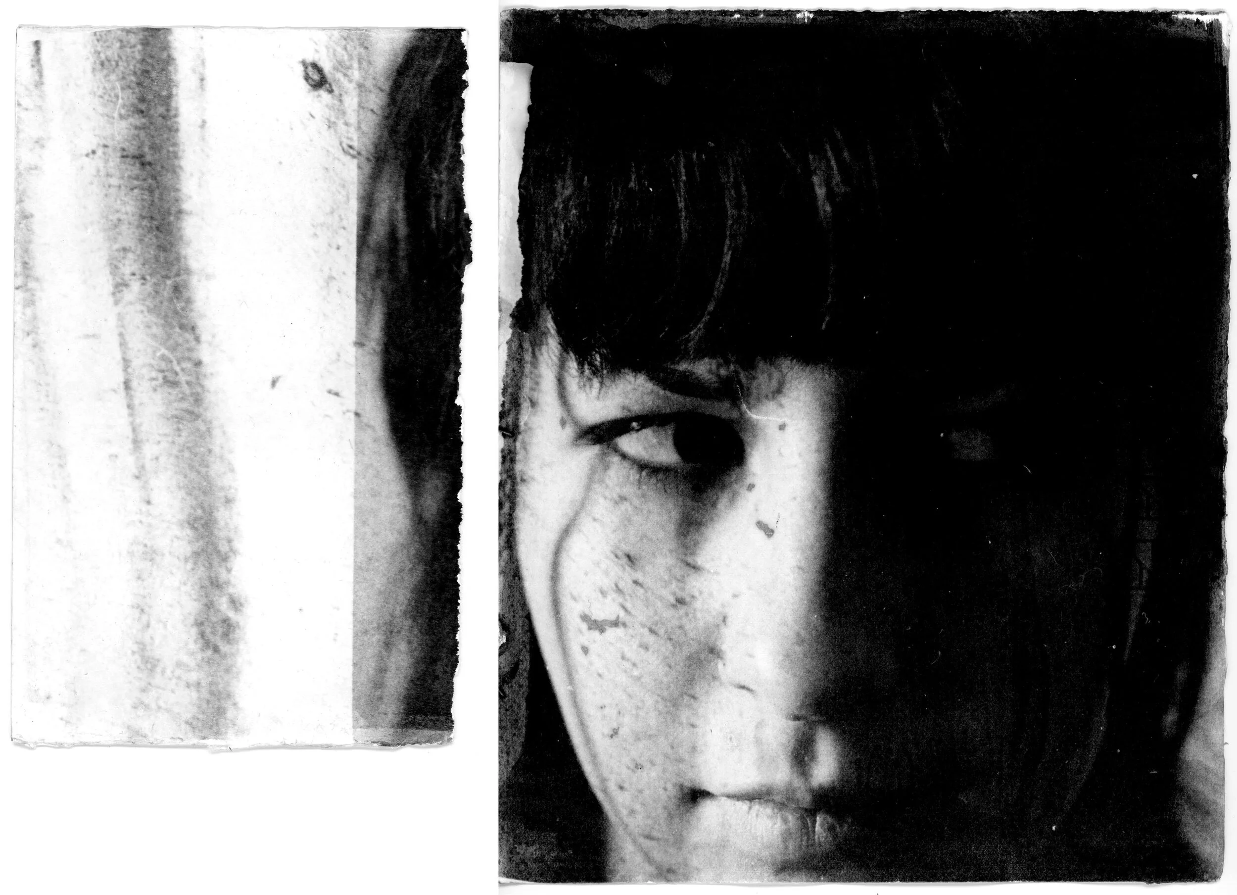
Untitled (Diptych)
Zo Damage, 2020
Unique print on Fabriano Rosapina from Ilford HP5 Plus 35mm negative
A hollowed fallen tree at the park highlights the fractured theme. Broken, it has taken on a new identity. In the hollow are a cluster of twigs, seeds and leaves. It may be a nest.
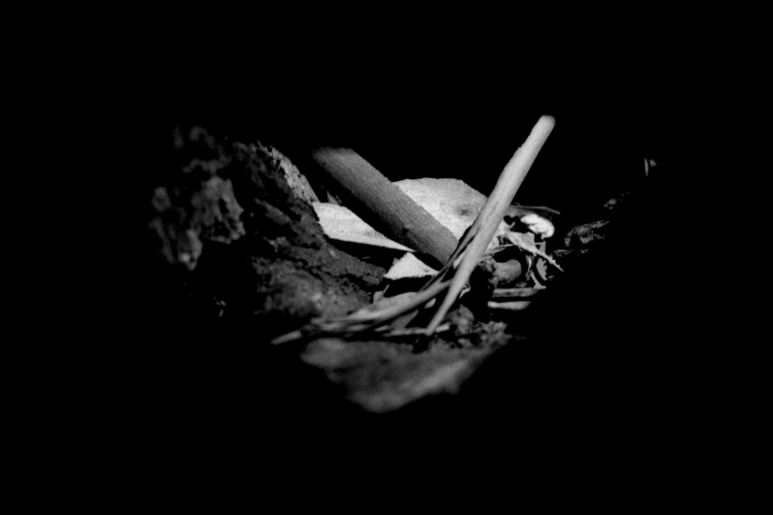
Sanctuary
Zo Damage, 2020
Scan from Ilford HP5 Plus 35mm negative
Pretty funny
I was told to remove all non-academic references from my student site, especially Wikipedia. This weeks CF lecture directly references Wikipedia.
Reflections: Collective trauma
Meetings are good. Despite this, I am feeling very lost, stuck. In all honesty, I like the concept of exploring the fractured theme but feel I am approaching it in a way that is just not me. Last week I came to a deep understanding of my community of practice, which Alison and I discussed at length.
I have been struggling to work with the topic of "collective trauma". I have a hard enough time managing a voice for myself. Although it would be ignorant to state that unpleasant things have not, and will not happen in my orbit, or that of my friends, I don't believe my life to have been in any state of "trauma". Disruptions? Yes. Pain? Sure. The cliche "It will pass" works on both sides of the fence. Good and bad. It's how I apply and utilise what I have learned from these experiences moving forward that count.
I have a gift. It is the ability to capture that which cannot be seen in a still. Specifically, energy, sound and emotion. The question now is, why am I not utilising all the resources at my disposal to hone and refine this skill set. Energy sound and emotion are primal, in the very core of my bones.
I took collective trauma on board when I shouldn’t have. Perhaps it was because I felt it was expected. Perhaps I feel that I am not “academic” enough. Perhaps I am sitting here feeling sorry for myself. The best part about acknowledging and owning questionable behaviour, particularly when it is toward myself, is stepping through the shit, and moving forward.
I have no idea what I will do. I do know that I need to trust my instincts. I do like the aesthetics of Kintsugi and the concept of apply Gestalt principles to my work. I just need to figure out how.
Keywords
35mm, 4x5, HP5, Fuji Superia, Colour, BW, Semester 2, Studio 1, Contemporary, Photography
Exploring fractured 4
New test prints. I have made a handful of DSLR images to save my film while I'm testing new concepts. They are "ok". The veil and soft-focus, achieved in-camera, worked well. The base image (below right) is on 35mm film. I photographed a series of these to experiment with concepts and ideas for my fractured theme. I am pleased with the results and prefer them as they are.
Boring
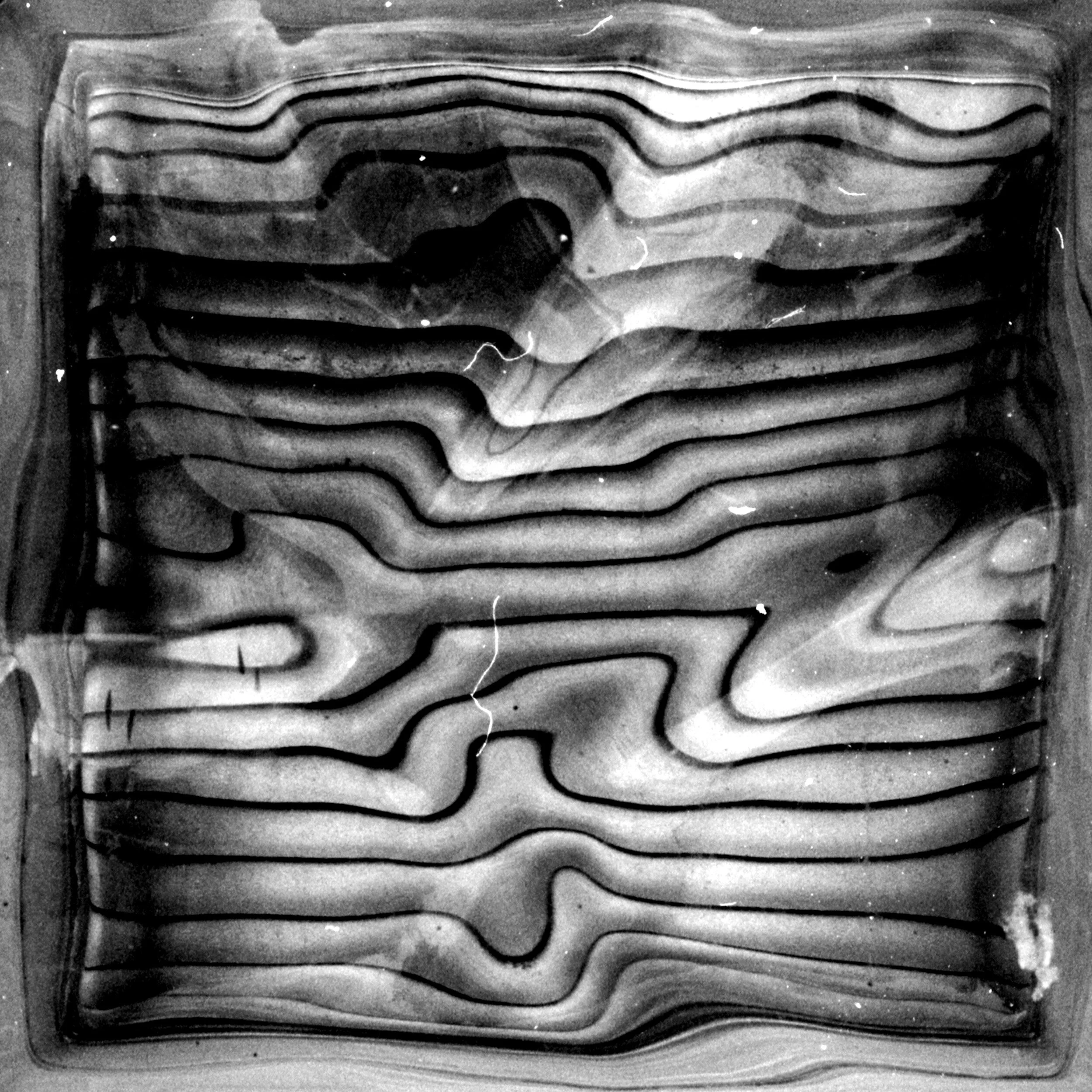
Interesting
Research and development 7
I have been thinking about the foundation of my fractured theme and basing it on the collective trauma COVID-19 and Melbourne’s Stage 4 lockdown. Speaking of cumulative trauma from a single perspective makes me uncomfortable and have realised that I can only talk or share of my own experiences, be they personal or ancestral.
The foundation of my I ZO series has subsequently changed, and I am now questioning transgenerational trauma. It is interesting to consider, particularly with my ancestry. I am looking forward to researching the psychological conditions of social, cultural or political impact (in many cases, all three) and their relationship with genetically passed on information and applying this to my practice.
My ancestors are Eastern European — Russia, Hungary and Romania – and on both sides (paternal and maternal), survivors of WWII Europe. We came to Australia seeking asylum and are refugees in this land that we now call home.
Immigrant Ships Transcribers Guild passenger log for the ship ‘Fairsea’ which departed from Naples, Italy on 22 September 1949, arriving in Melbourne on 19 October that year.
The website states that “this is the passenger list for ‘International Refugee Organization Group Resettlement to Australia’, containing individuals and families that migrated to Australia after World War II from various European Countries including Germany, Hungary, Russia, Ukraine, Latvia, Poland, Czechoslovakia, Romania, etc. Most passengers are World War II refugees or displaced persons”. My father, his mother and siblings were on the ‘Fairsea’.
After careful consideration, I am satisfied that my research and application of the aesthetics and theories of Kintsugi, Wabi-Sabi and Gestalt are applicable and relevant to this shift in my project. The images relating powerfully in a contemporary setting.
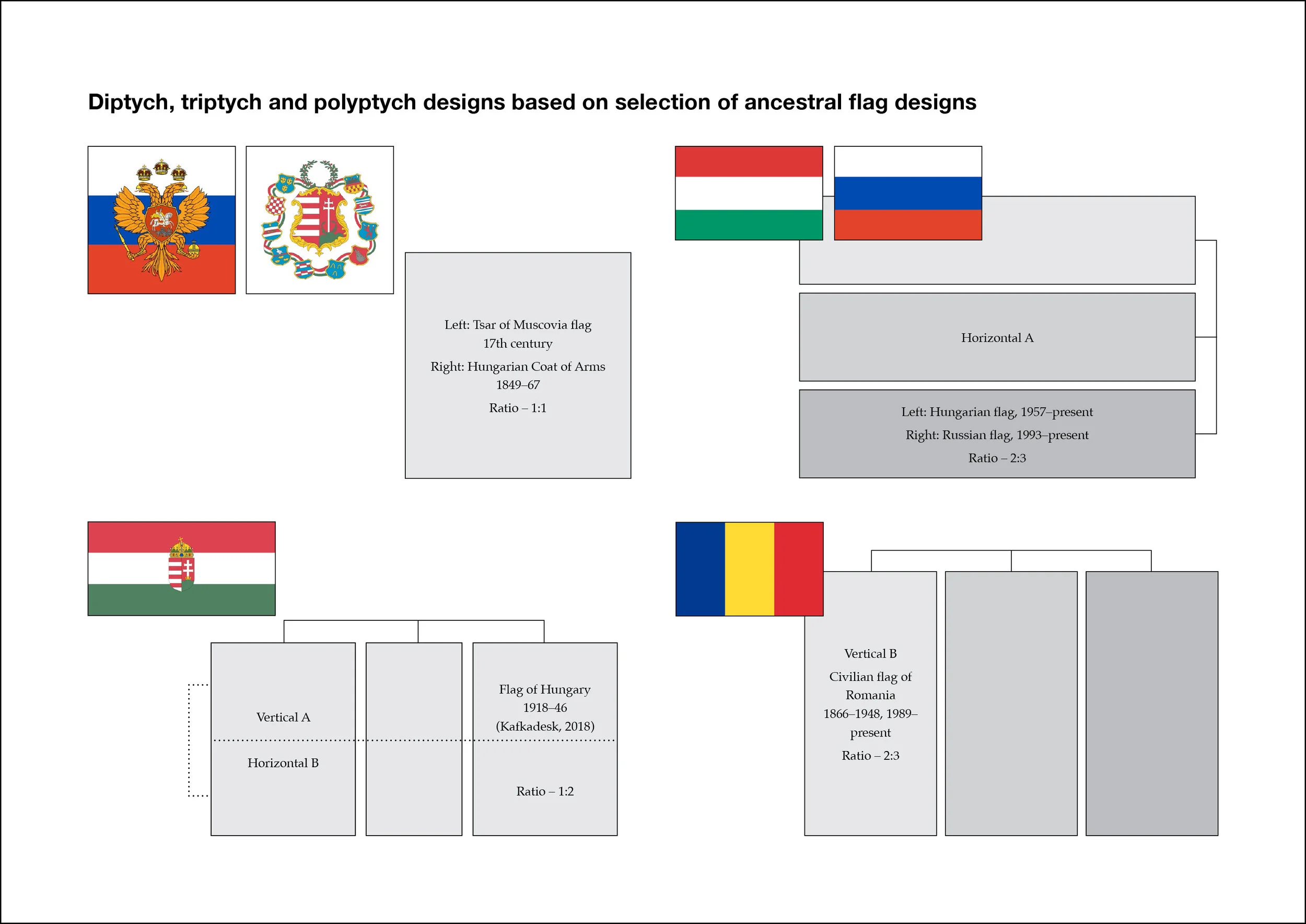
Gay, Z 2020, Diptych, triptych and polyptych designs based on selection of ancestral flag designs
I have made the chart above to show the influences and methods applied in creating diptych, triptych and polyptych displays in my I Zo collection based on the research of my ancestral flags designs.
Quote
What interests me is the unforeseeable. — Sigmar Polke (Thistlewood, D 1996)
References
‘European Commission Grants Funding for Project on Transgenerational Transmission of Trauma’, NewsRx Health 2018, viewed 23 August 2020, <https://primo-direct-apac.hosted.exlibrisgroup.com/permalink/f/aqirjb/TN_cdi_gale_infotracacademiconefile_A555320343>
‘Findings from Deakin University Broaden Understanding of Social Science (Transgenerational Epigenetic Inheritance and Social Responsibility: Perspectives from the Social Sciences)’ 2018, Health & Medicine Week, viewed 24 August 2020, <https://primo-direct-apac.hosted.exlibrisgroup.com/permalink/f/aqirjb/TN_cdi_gale_infotracacademiconefile_A550708143>
Immigrant Ships Transcribers Guild nd, ‘Fairsea’, viewed 21 August 2020, <https://immigrantships.net/v5/1900v5/fairsea19491019.html>
Koran, L 1994, Wabi-Sabi for Artists, Designers, Poets and Philosophers, Imperfect Publishing
Krohn Amorose, V 2013, Art-Write: The Writing Guide for Visual Artists, Luminare Press
Lesser, C 2018, ‘The Centuries-Old Japanese Tradition of Mending Broken Ceramics with Gold’, Artsy, viewed 22 July 2020, <https://www.artsy.net/article/artsy-editorial-centuries-old-japanese-tradition-mending-broken-ceramics-gold>
Critique & reflection
Critique methodology, practice and intent of work.
Is it technically driven?
Is the narrative aesthetically or visually driven?
Is it both? It should always be both.
Research past and current practitioners in direct relation to project intent and outcome.
Keywords
Critique, Gestalt, Methodology, Aesthetic, Visual, Narrative, Lens-based, Film, Colour, Double exposure, Heuristic, Reflective