
S2 S1 Week 9
Presentation
I ZO faces breaking points past and present, embracing the flawed and imperfect.
The collection combines alternative printing and darkroom processes. Many prints fractured with a diptych, triptych and polyptych displays, the fragments honoured and reconnected, with a newfound voice and beauty. What are imperfections? They are that which makes the whole.
— Zo Damage
Feeling broken and lost amidst the intensified isolation, I seek to make sense of the world and am confronted by coming with my own company. I search for ways to embrace the restrictions and the creative process in a positive light.
"I Zo" is a story of breaking points, healing and the joy of being imperfect.
I have made this work using film photography, darkroom printing and alternative print methods. The collection includes a series of diptych, triptych and polyptychs displays, further highlighting the fractured theme.
My research includes Kintsugi inspired applications to the work. Kintsugi or "golden joinery" is the Japanese art of repairing broken pottery with lacquer mixed with precious metals including gold and silver.
Philosophically, Kintsugi treats breakage and repair as part of the history of an object, rather than something to disguise, embracing the flawed or imperfect. Marks of wear by the use of an object are also highly valued.
I have also researched Gestalt design principals, where the brain seeks to make sense or order of fragmented or impartial images.
The application of these aesthetics further disrupts the narrative, leaving the viewer free to reconstruct, connect and interpret each piece while emphasising the project topic. Visually and philosophically, the Kintsugi and Gestalt aesthetics reconnect the fragmented and fractured. Their beauty redefined.
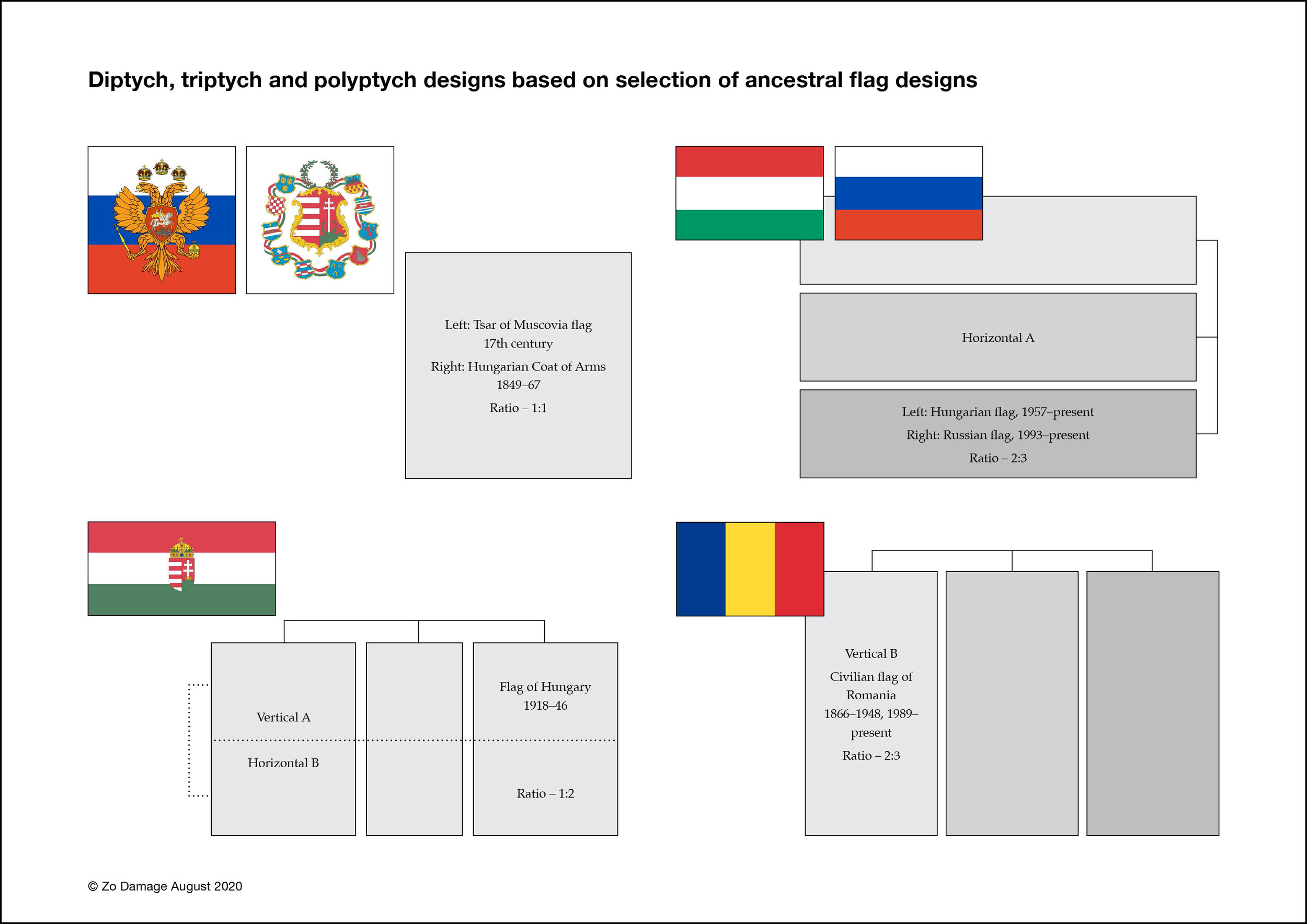
I have created a number of charts (including the above) exploring diptych and triptych designs based on my research on my ancestral flags.
My ancestors are Eastern European — Russia, Hungary and Romania. Survivors of WWII Europe, we came to Australia seeking asylum as refugees.
I am exploring the shapes and geometric designs of my ancestral flags to develop the configurations, shapes and dimensions of the diptych, triptych and polyptych displays in the collection.
This concept also aligns well with Gestalt design principals.
Experiencing the physicality of the work is essential. There is nothing quite like seeing the prints, even when they are small proofs. The images need to work in an online presence, but the intention of the work is always physical. They need to work beautifully across many platforms and potential output mediums.
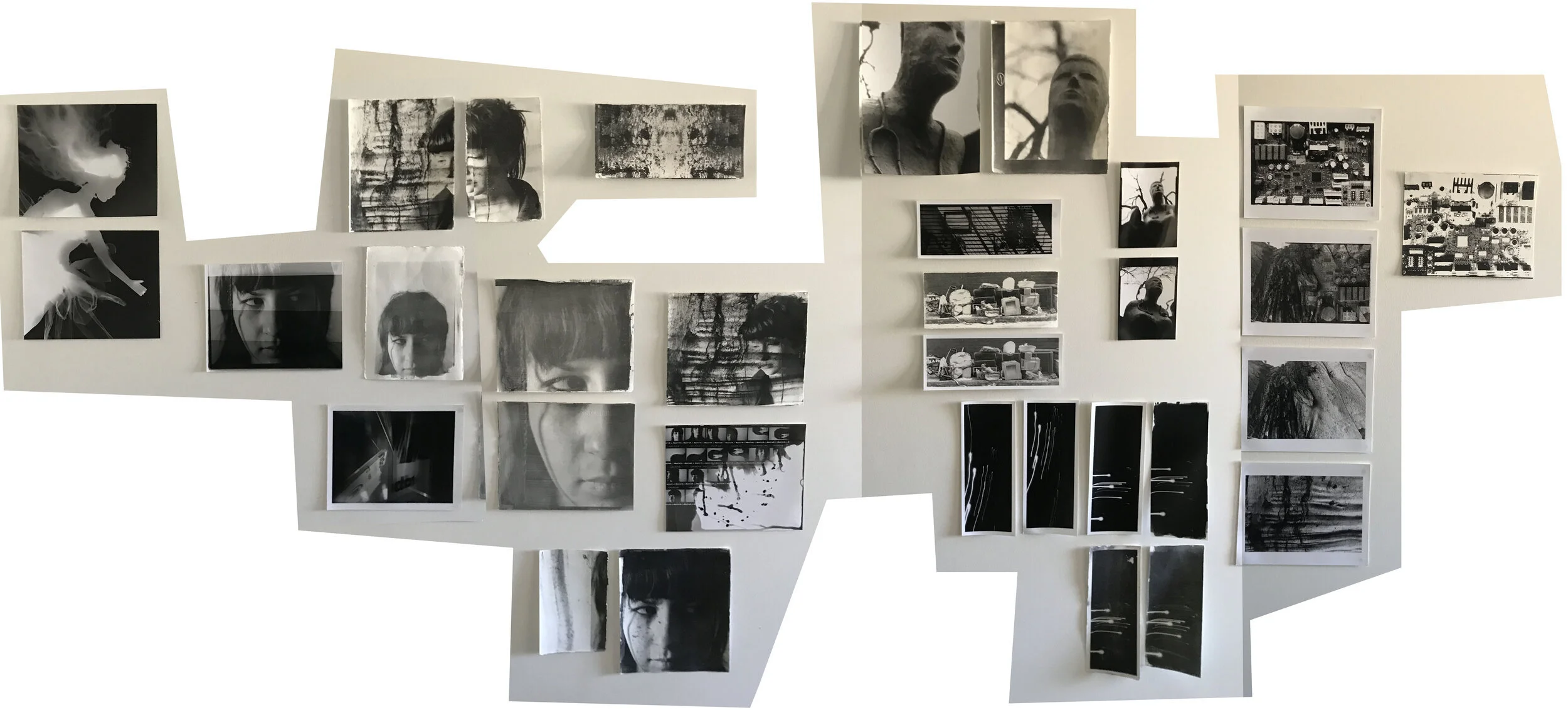
Walls and cupboard doors covered with test prints of current works in progress including liquid light on rag, silver gelatin MGIV and giclée test prints.
Darkroom and alternative print methods require a massive investment of time and willingness to take risks trying new things to produce successful and consistent outcomes.
Testing of the liquid emulsion has been challenging. A great deal of planning and design is also required when considering Kintsugi and Gestalt aesthetics.
The style of images also impacts significantly on the overall look and feel of the final print.
Liquid emulsion prints have a very organic look and feel to them, mainly as the emulsion is hand-painted onto the surface to be exposed.
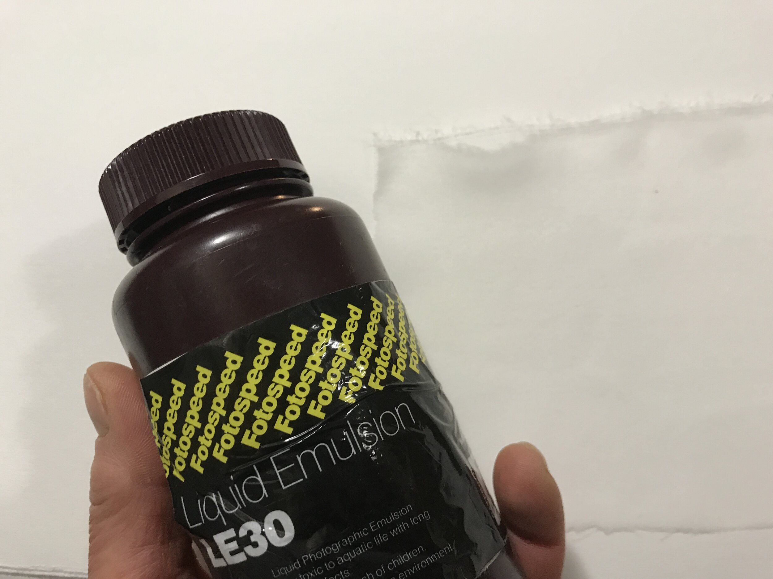
Liquid emulsion is a light sensitive silver gelatin compound.
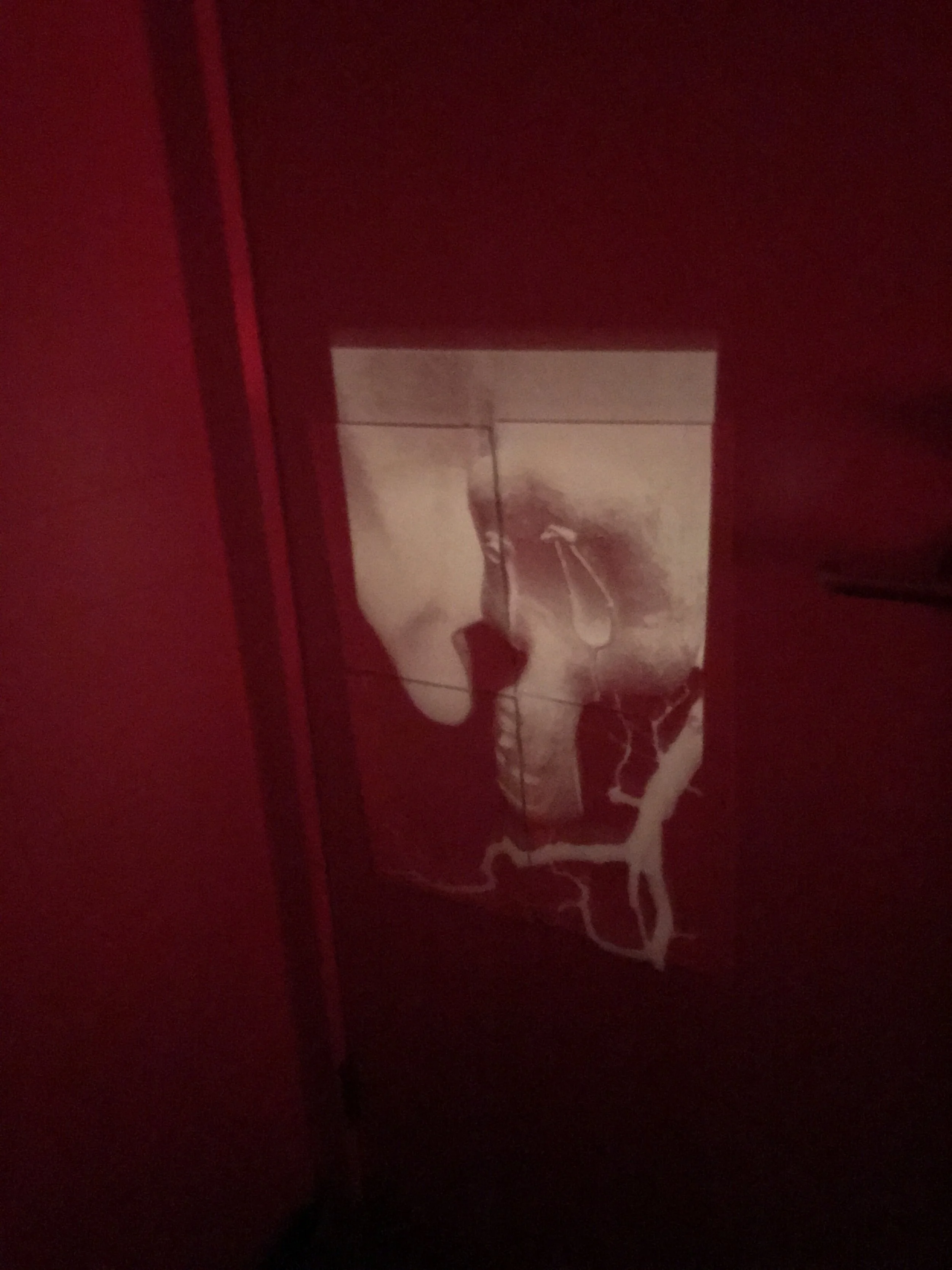
Liquid emulsion treated paper tiled onto the bathroom door. This photograph was taken during the exposure process as the liquid emulsion is light sensitive “silver gelatin” (as with standard photographic paper stock). Safelight is necessary when working with these materials. In some instances, there needs to be complete darkness.
Reflecting on the colour images presented in Week 6 display affirmed that the colour was a distraction.
I am happy with the new B&W images. They invite personal interpretation and emotional connection for the viewer and give the collection a beautiful flow, better reflecting the narrative of the series.
The addition of new styles of photography (portrait, landscape, still-life) brings a deeper connection and continuity to the overall body of work.
A simple portrait or still life can be compelling. The gestalt inspired displays concerning the fractured theme represent the split in knowledge, genetic line, and ancestry recreated as independent and new, yet still connected.
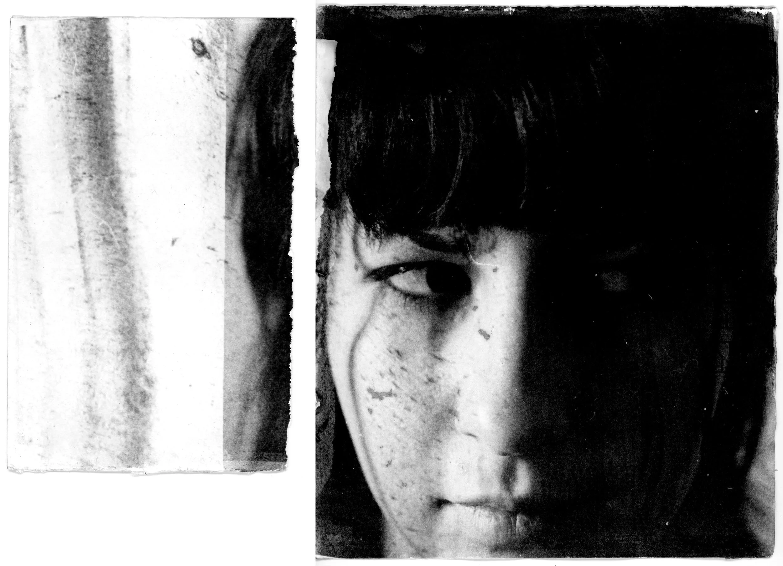
Untitled (Diptych)
Zo Damage, 2020
Unique print on Fabriano Rosapina from Ilford HP5 Plus 35mm negative
A hollowed fallen tree at the park highlights the fractured theme. Broken, it has taken on a new identity. In the hollow are a cluster of twigs, seeds and leaves. It may be a nest.
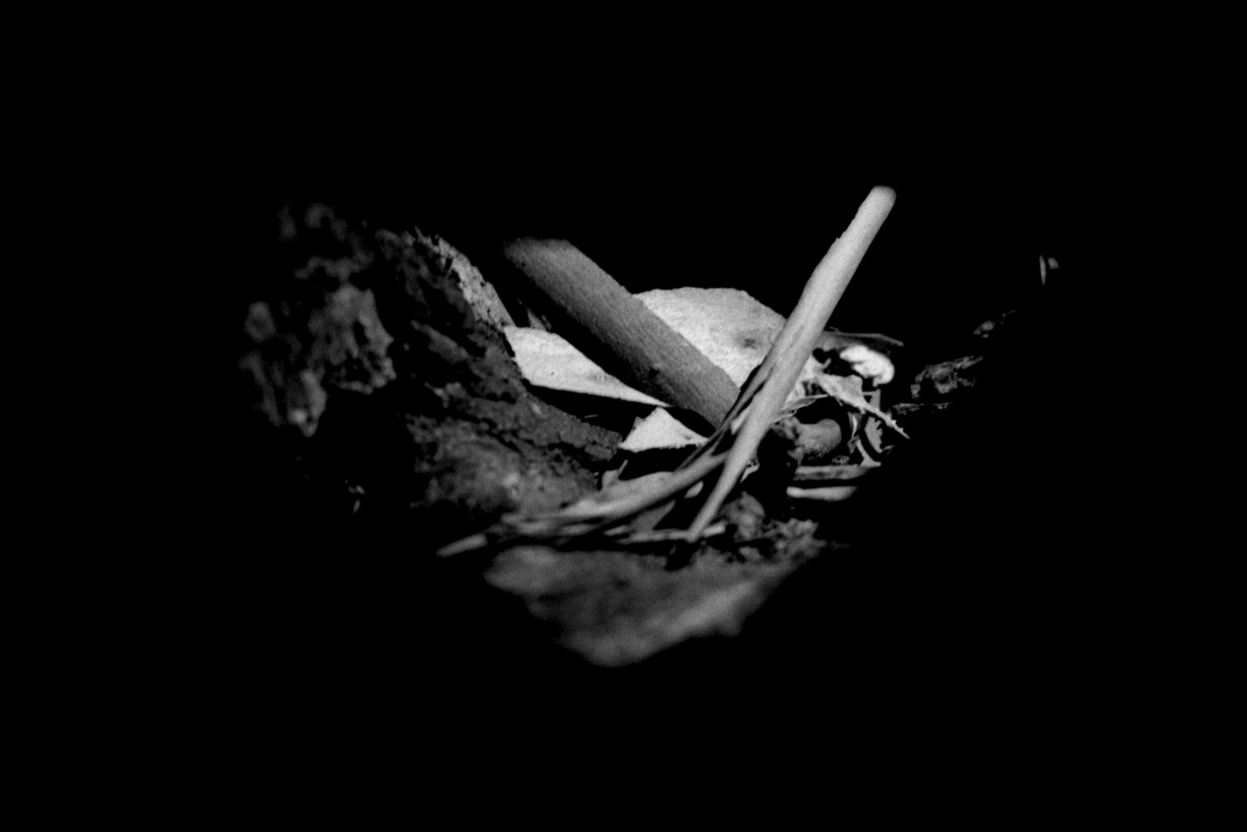
Sanctuary
Zo Damage, 2020
Scan from Ilford HP5 Plus 35mm negative